A friend has a line of stamps called "Me and Carrie Lou". She has taught us to watercolor using Tombow markers. The results are stunning as shown by this fish. I love the whole watercolor experience this way. I heat embossed the waves with white detail embossing powder from "Sparkle n Sprinkle", I used 2 shades of blue and twisted citron green oxide inks for the water. The fish was colored with yellow, blue and green tombow markers using a water brush to move the color. I fussy cut him out and popped him up with dimensionals. He was heat embossed with gold tinsel embossing powder before coloring. I added some clear dots for bubbles and a sentiment from Taylored Expressions.
Wednesday, June 27, 2018
Tuesday, June 26, 2018
MFTWSC390
This year when we were at a card making retreat, we played with backgrounds. This was made on silver paper with alcohol inks. I was doing some rearranging this week and came across it. It is one of my favorites. I thought it went well with the little bees as there is a lot of yellow in it.
Friday, June 22, 2018
ctd498
What fun colors! Of course the pinks brought flamingos to mind. It was mixing in the peach that caused the trouble for me. I met with a group of ladies on Wednesday, and the theme for the afternoon was dots, lots of them. When I saw the difference the dots made in the designs, I knew I had my answer. I love the way the the peach warms up the white circle and really makes the flamingo stand out.
Tuesday, June 19, 2018
MFTWSC389
I think this background is still my all time favorite. I stamped it in Versamark and heat embossed it with white detail embossing powder. I inked it up with oxide distress inks in various colors. I chose a combination that I liked and cut it with a stitched rectangle. I cut out the "you" 3 times and added it to my background. I coated it with Metallic Gilding Polish which gives a shimmery pearl look with a hint of gold. I love the look.
Monday, June 18, 2018
ctd497
I love this color combination. The butterfly was stamped with Versamark on watercolor paper and heat embossed with white embossing powder. It was colored with blue and yellow making green in places and then highlighted with Abandoned Coral. The word hello was colored with first yellow and then abandoned giving it an ombre look. I used black cardstock to make the colors pop.
Sunday, June 17, 2018
SIP154
I made this card for my husband for Father's Day using the new Hero Arts kit. I fell in love with the layered water and it did not disappoint. The sailboat and birds are also from the kit. I'm really happy with the way this turned out and he loved it.
Designer's pick
Tuesday, June 12, 2018
MFT birthday project June
For a summertime birthday, nothing says celebrate like ice cream. Our little people love ice cream cones with sprinkles on them. My take on this delight.
Monday, June 11, 2018
ctd496
Birthday card for a man. Supplies are all from MFT. I love this new background stamp. Not only are the dots circular but they fade! I love the combination of the aqua and black. Manly but fun.
Saturday, June 9, 2018
FMS340
I made this card for my husband of 56 years. The sentiment is from Technique Junkies and I have been saving it for just this occasion.
MFTWSC388
I saw a flier at a craft store using a cutting plate with a valley in the middle of it. I remembered that I had one of those from a long time ago. It seems that if you place your die with a part of it in the valley, it won't be cut. That's what I did with the butterfly. I masked it, stamped the background and then placed it on the special cutting plate with the body in the valley. It worked! All that cut was the wings.
Tuesday, June 5, 2018
MFTWSC387
I had so many ideas for this sketch, but they were similar to what others had done, so I opted for this one. I forgot how hard it is to work with all these tiny pieces! The flowers are from an old die-namics which has a potting bench, pots, flowers, etc. I cut the boxes from wood paper as rectangles and shaped the edges.
Monday, June 4, 2018
ctd495
Such rich colors. I love the way this turned out. My flower looks red, but it is really cranberry color.
fms399
I had fun with this sketch. This is birthday season for me so any time I can make a card that is either for a man or woman, I am a happy camper! I love the way this turned out and I can see many other possibilities for the layout.
Sunday, June 3, 2018
SIP152
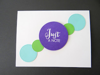
I love these colors together, but too much of a good thing can be overpowering, so I decided to go with a more simple card. I love the way it turned out. I'm thinking of making 3 more of different colors to give as a gift.
Subscribe to:
Comments (Atom)


