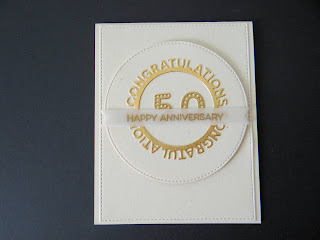
I love the way this card turned out. The nice big circle really becomes the focal spot for the sentiment. I also have to say that the new vellum cardstock is wonderful. Heat embossing on it is a dream.
Tuesday, May 29, 2018
Monday, May 28, 2018
Sunday, May 27, 2018
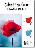
ctd494
I made this card for our son's birthday. He was born on Memorial Day. I was musing about a different card this year. When I saw this color combination, I was inspired. He is an Army Veteran and he is very proud of his service. He and his wife live across from an old cemetery, and they took it upon themselves to place flags on the graves of soldiers. There are some from the Civil War including a Medal of Honor recipient. He was instrumental in acquiring a plaque for this soldier.
SIP151
I love the script in this set so I gave it center stage. This is the latest card kit from MFT along with a cover up die from them as well. I love the angles and the space to feature a sentiment.
Wednesday, May 23, 2018
MFTcolor93
I have channeled my best Inge Groot today for this color challenge. I love the way this turned out. I knew that I wanted to use flowers for this one, but which one? MFT has so many to choose from. I chose the daisies and I love it. The detail in the centers is not a white gel pen, but part of the stamp itself. How great is that!
Monday, May 21, 2018
ctd493
I made this background by stamping the swirl stamp in versa mark on summer splash cardstock and then embossing with clear embossing powder. Using the triangle stencil, I added twisted citron oxide ink. I added a white 'hello" with citron along the bottom. I love the way this turned out.
FMS337
An interesting sketch. I wasn't sure about it but as it came together, I grew to love it. Stamps are from Verve and papers are from MFT.
Monday, May 14, 2018
ctd492
I must say, I am loving the color challenges. I have put together colors that I never would have chosen on my own. Really have looked at focal and supportive pieces in an entirely different way. I love this combination and love the way it turned out. I'm keeping this one to use again!
Sunday, May 13, 2018
SIP149
I made this card for a young lady who was awarded her Master's Degree in Occupational Therapy. It is definitely a reason for celebration!
Wednesday, May 9, 2018
MFTCOLOR92
I will admit these colors posed quite a challenge for me. I looked at it daily. I had cut out the new stitched blooms and in playing with them, I knew that I could mix lemon chiffon with safety orange and come up with some nice flowers. Adding the steel blue leaves and blue yonder distressed patterns brought it together.
Tuesday, May 8, 2018
MFTWSC383
My granddaughter turns 13 this month. She volunteers at a rescue shelter for cats. I thought this would be appropriate for her!
Monday, May 7, 2018
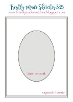
FMS335
I think this sketch is elegant. I used a "shadow" technique for my flowers. It adds interest without bulk. It would make a great sympathy card.
Friday, May 4, 2018
ctd491
This came together so much better than I thought it would. The stamp is from Technique Tuesday and when I Googled images of lilies, I saw a most beautiful coral one and knew it would be perfect for this challenge. I stamped on watercolor paper and used "coral crush" ink to watercolor the flower, making the stamen darker in color by adding another layer. The leaves were colored with green and the flower die cut using the matching die. When I laid it on the kraft card, it looked too plain, so I used a leafy stencil and some white ink. The sentiment is from Verve and heat embossed with white.
Thebirthdayproject
The Birthday Project
Shaker Cards
I ordered this shaker frame when it was released. I have made many cards using it. It is perfect for any celebration-just vary what goes in it. Since this is the birthday project, I chose a birthday bear and a sentiment from the same set. The bear is colored with copics and the background is made using the small cloud stencil and blue breeze ink. The grass is made using the hills stencil and adding some grass patches with a copic marker.
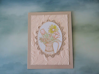
SIP148
So this challenge was farmhouse chic. I looked up some examples and they seemed to have pastel and neutral colors and used unexpected items for decorative pieces. I found this old Inky Antics stamp with a metal pitcher holding some flowers. I watercolored the image with light colors and made the pitcher a neutral tan color with splotches of vintage gold. I added a doily of the same neutral color. I really love the way it turned out.
Subscribe to:
Comments (Atom)


